


Culture on My Mind
Drew Struzan
November 24, 2025
Drew Struzan was an huge part of my childhood and geek upbringing. His artwork graced album covers, book covers, collectibles, and over 150 movie posters from the 1970s through the 2010s. His airbrush technique was a favorite of Steven Spielberg and George Lucas, and was developed during his years working on B-movies.
He died at home on October 13, 2025, at the age of 78 after a battle with Alzheimer’s disease.
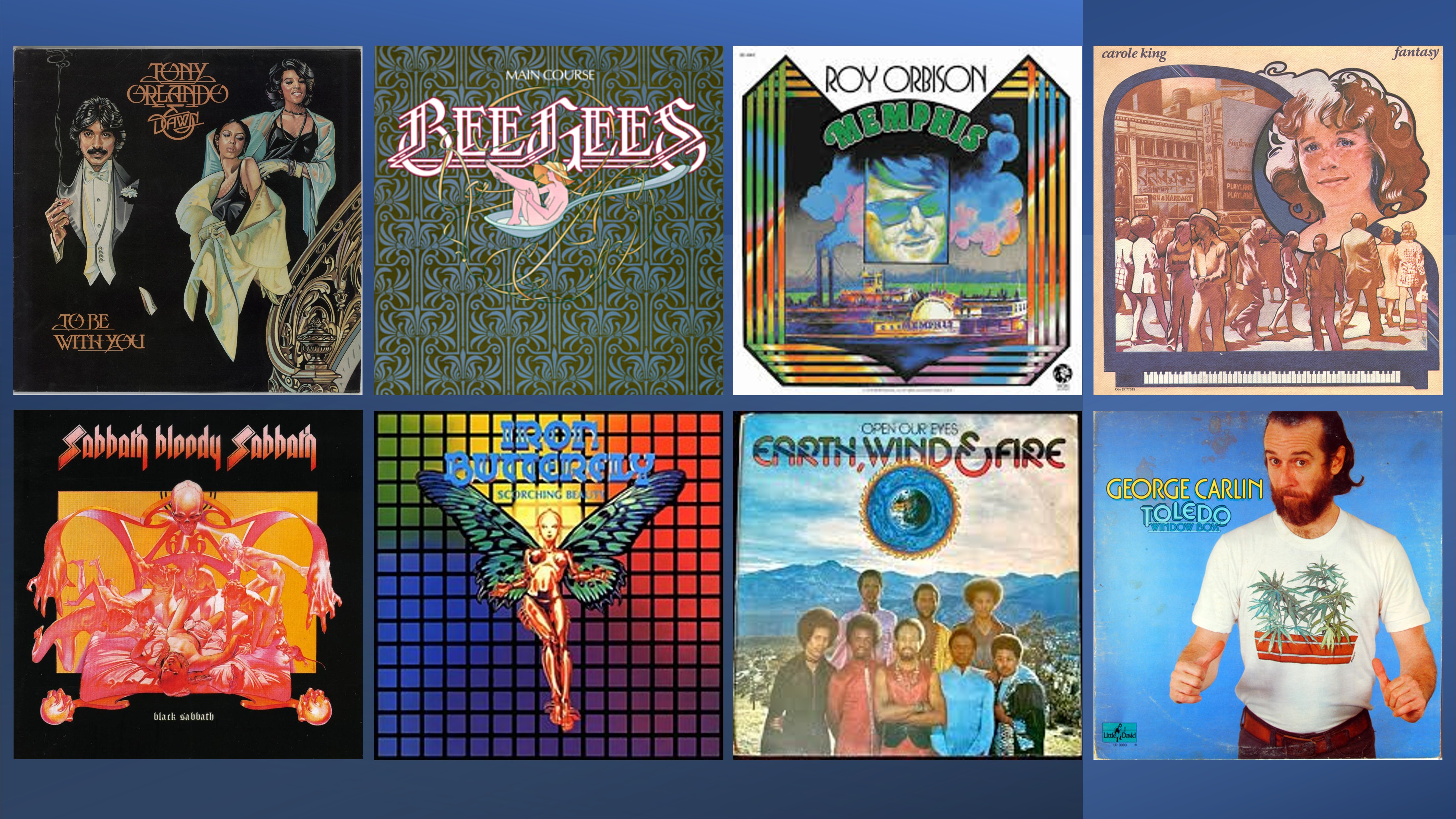
His early career included album covers for a ton of musical artists. In 1975, he designed the cover for Main Course, the Bee Gees album that introduced the now-iconic logo and a new direction for their overall sound, including hits like “Jive Talkin'” and “Nights on Broadway.”
Struzan maintained a list of his album covers on his website. One that isn’t listed there is George Carlin’s Toledo Window Box from 1974, on which Struzan illustrated the famous marijuana T-shirt.
It is impossible for me to describe Struzan’s works from stem to stern. The man worked for around five decades and created hundreds of pieces of art, many of which intersected with my pop culture interests through my childhood and into adulthood. Instead, I’m celebrating his legacy with a bunch of my favorite pieces over the years.
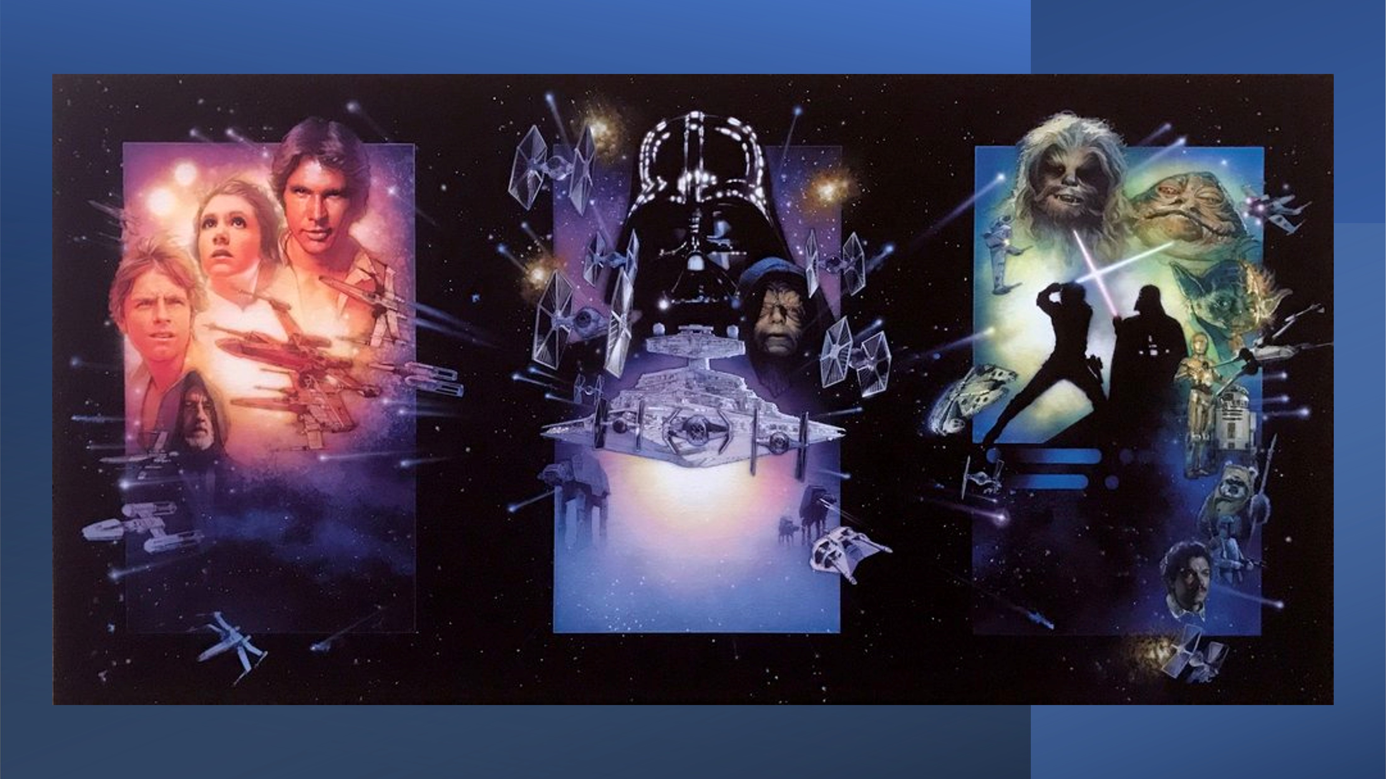
The Star Wars Trilogy Special Edition is most likely when I really started paying attention to Drew Struzan’s work. In 1996, I had started my first job working custodial part-time in an elementary school. Since my parents introduced me to the original Star Wars trilogy, I paid for tickets to each of the opening night of each special edition film. There were four posters for that set of releases: One for each film and one for the overall trilogy. Struzan’s art graced the individual film posters and were designed as a combined tribute to the trilogy.
According to his entry about the Special Edition triptych:
With the theatrical release of the Star Wars special editions, Struzan created the three-panel triptych poster in 3 weeks, working day and night through the Holidays starting in December ’96 and finishing in January ’97. He did not paint it as one picture but as three individual pieces of art. Each one was produced as a single poster for the staggered premiers of each of the three films. It was not until later that people began to discover that set side by side in the proper order the three posters became one image.
Upon seeing this George Lucas had gotten new favorites for his opus. Thereafter when drew painted the Episodes I, II and III poster art he did so to match the design concepts of the Triptych to make a complete series to hang all together. Hang together, which they do, all six, at George Lucas’ screening room at Skywalker Ranch.

It was those prequel posters that solidified my love of Struzan’s style. Admittedly, I’m a bit biased given my love of Star Wars, but the saga’s cinematic resurgence from 1996 to 2005 was a bit part of my life. Like the 1996 releases, I caught The Phantom Menace on opening weekend with my family after months of watching the trailers after my friend burned them onto a CD for me. I took my girlfriend (soon to be fiancée) to the premiere of Attack of the Clones and my wife to Revenge of the Sith. The posters were a visual sequel to the Special Edition posters, and amped up my excitement for the prequels.
From one of Struzan’s pages about The Phantom Menace‘s artwork:
Drew speaking with George Lucas director and writer of the Star Wars Epic Drew: “Why do you use illustration to advertise and represent your projects? Computer manipulated photographs dominate the advertising of so many studios, but you continue to loyally choose illustration….”
George Lucas: “The kind of movies I make are more fanciful in nature, more mythical in nature. To market my films, I like to move one step away from photo- realism to something that’s a little grander, a little more glorious, and something a bit more romantic than what you get with just simple photographs.”
From his page about Attack of the Clones:
A war? For drew, this was the first time an art director got in the way of a design and concept for a Star Wars poster. George Lucas had always just left it to drew to conceive his posters for Star Wars. He, the “art director” decided he wanted the main characters to mimic the pose from the 1965 film Dr. Zhivago. Not unusual this was for an art director to make aesthetic decisions but it was the first time while working with Lucasfilm and George Lucas. Drew made the best of it as he always had and made a striking poster regardless.
Drew won the war.
Finally, from one of his pages about Revenge of the Sith:
For drew this film ended a 28 year journey through a fantasy of joy, opportunity, fulfillment and an altogether lifetime experience of unbelievable blessings. This was truly epic!
The computer age left many an artist without work but George was always loyal. He remains loyal to the art of illustration, loyal to his own creation and the artwork that represented it and loyal to the artist that came to be recognized as ‘The’ Star Wars artist. Revenge of the Sith was truly the bow on top of a wondrous life with the ‘man’, George Lucas.
Notably, his work for this film was modified from his original.
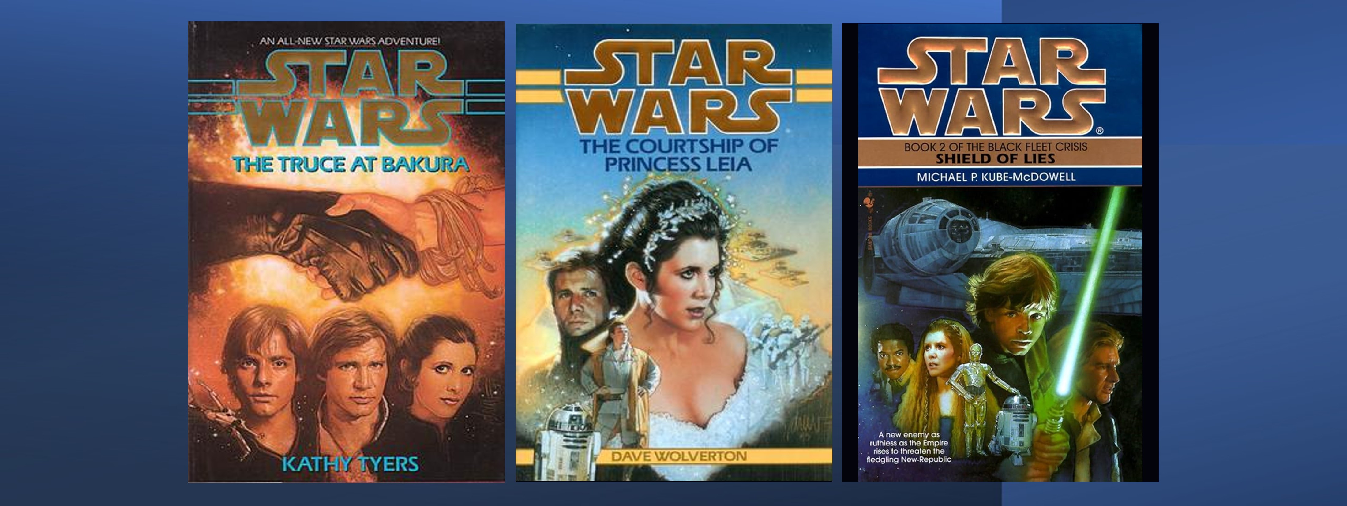
In his role as “the Star Wars artist,” Struzan crafted artwork for at least eight film posters, forty comic and novel covers, and various other projects for the franchise. He did a lot of gorgeous work, including the crazy Jedi Prince series of young reader books, the Corellian trilogy, the Han Solo trilogy, the Hand of Thrawn duology, and more. Of his work, my favorite three are The Truce at Bakura, The Courtship of Princess Leia, and Shield of Lies from the Black Fleet Crisis trilogy.
Memorably, The Courtship of Princess Leia was the first book where I bought both the hardcover and paperback versions because the hardcover artwork was so gorgeous. I didn’t like the paperback as much, but I wanted to keep the hardcover as pristine as possible.
The wedding dress artwork moved to paperback when the book was reprinted under the Legends banner. Sadly, the new Kindle cover does nothing for me.

Drew Struzan also lent his hand to the Indiana Jones series, from the movies to the novels, rides, games, and The Young Indiana Jones Chronicles. He started with the Raiders of the Lost Ark foreign poster, but I’m more fond of his work for the domestic posters advertising Temple of Doom, Last Crusade, and Kingdom of the Crystal Skull.
In researching for this post, I also found an unused painting for Kingdom of the Crystal Skull that was commissioned by George Lucas and abandoned for the advertising campaign. It’s dark and mysterious, and matches the opening half (or so) of the movie.

Struzan’s relationship with George Lucas continued with the two editions of The Creative Impulse, the books that chronicled the first twenty and twenty-five years of Lucasfilm’s history. Both covers are highlighted on Struzan’s website – first and second editions – and the write-up for the first edition showcases George Lucas’s note of appreciation for Struzan’s work:
The original painting arrived today, and I just wanted to tell you how thrilled I am with it. It turned out even more beautifully than I had anticipated. Everyone who has seen it thinks it’s great. I know how much hard work goes into a project of this nature, and I truly appreciate your talent as an artist.
Warmest regards,
George Lucas
To celebrate the Star Wars 30th anniversary, Struzan collaborated with the United States Postal Service to issue commemorative stamps featuring various characters and vehicles from the (at the time) six-movie saga.
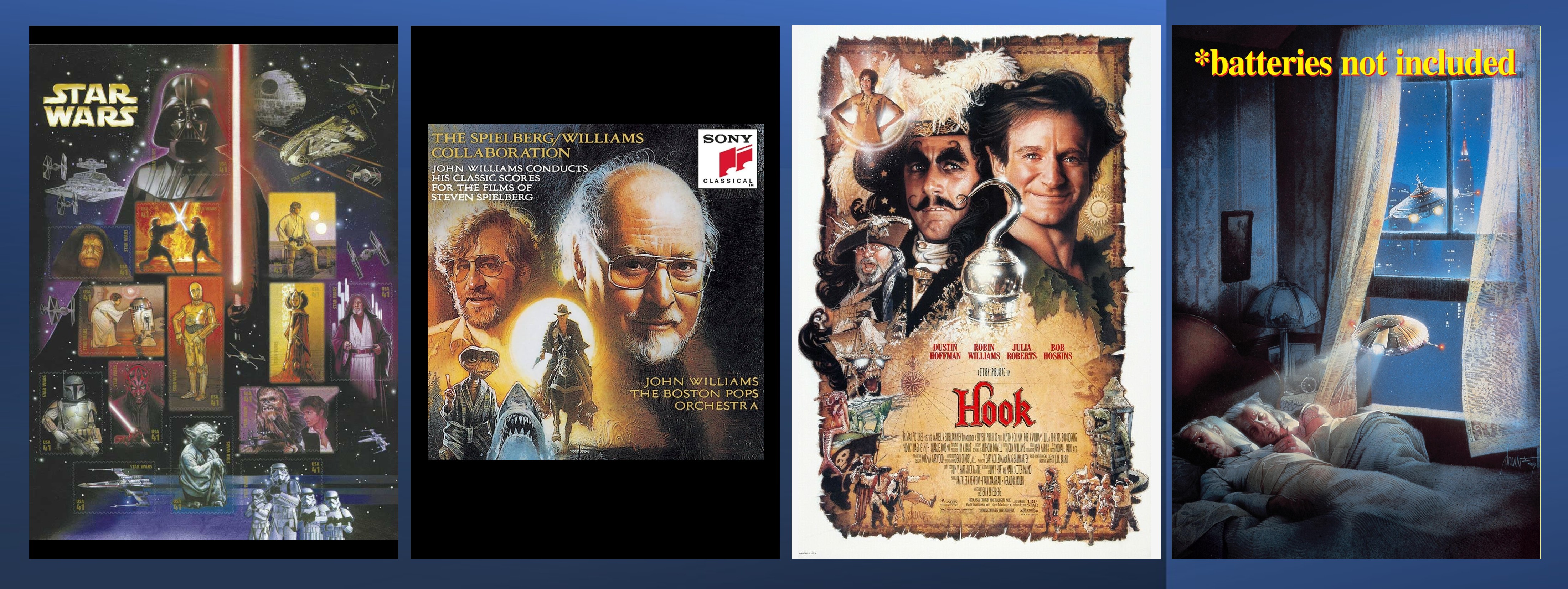
He also helped to celebrate the 1991 release of The Spielberg/Williams Collaboration, a collection of music from the epic combination of filmmaker and composer.
Composer John Williams and director Steven Spielberg have long had one of the most symbiotic relationships in Hollywood. They’ve helped each other become the best known, most successful, and most powerful men in their respective fields. Spielberg has hired Williams to score nearly every movie he’s ever made.
This original artwork graced the cover of their collaborative collection.
His art graced the posters for both Hook and *batteries not included, two fun and uplifting fantasy films. Hook (from 1991) was directed by Spielberg while *batteries not included (from 1987) was conceived by Spielberg for his Amazing Stories television anthology series, directed by Matthew Robbins, and produced by Spielberg’s Amblin Entertainment.

In 1985, 1989, and 1990, the Back to the Future trilogy was released. All three were directed by Robert Zemeckis, and the first chapter’s reception blew the door wide open for the entire story to be told. The posters were designed to play off each other, and Struzan considered the art to be like the story: One unified vision.
From his website:
As the movie is one story in three parts, so the classic artwork cannot be seperated [sic]. They remain one.
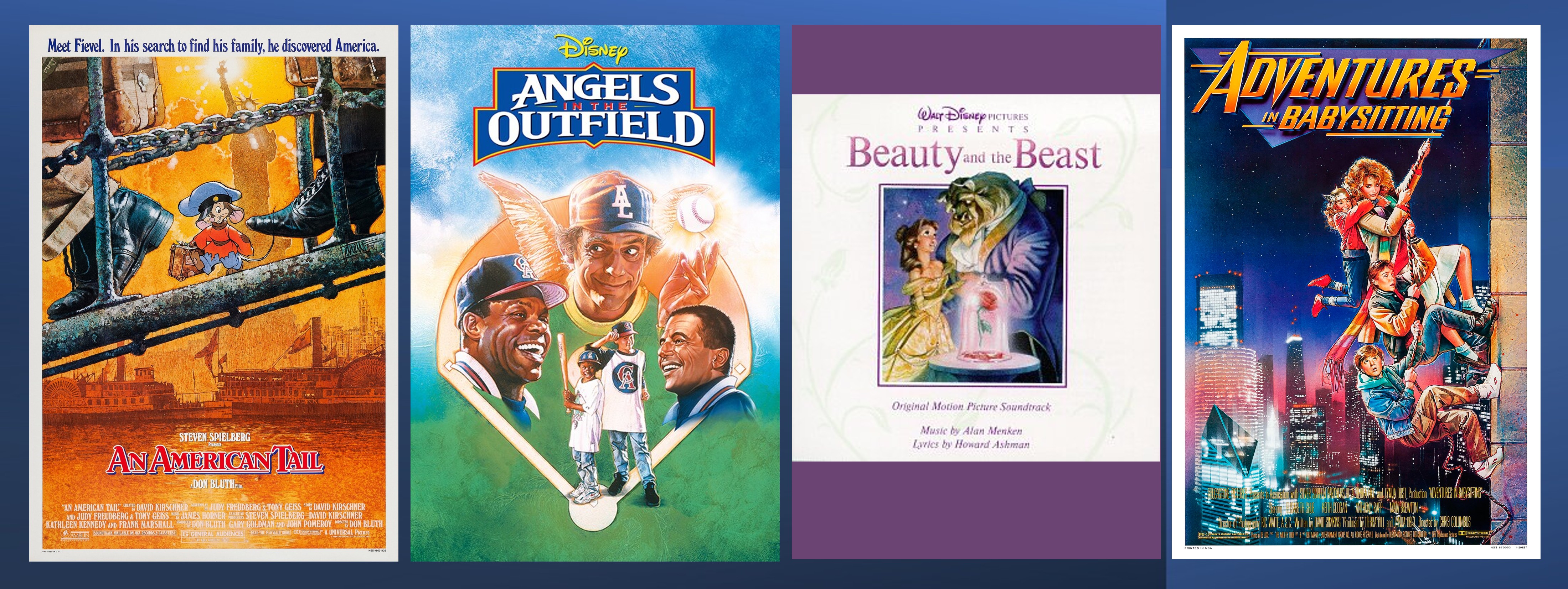
An American Tail, Adventures in Babysitting, and the Disney library were big parts of my experience in the ’80s and ’90s. An American Tail is a beautiful Don Bluth film about Jewish immigrants and served as a good primer for me about the topic in the mid-’80s. Adventures in Babysitting was a fun romp with a great lead actress in Elisabeth Shue. It also introduced me to Anthony Rapp and Vincent D’Onofrio, and still ranks highly among my favorite teen comedies. Angels in the Outfield was just a fun fantasy romp with lot of names and faces I recognized from across TV and film.
One of the standout titles from the era is Disney’s Beauty and the Beast, which showcased Struzan’s art on the CD soundtrack. He shared an fascinating tale about the artwork:
The original art was created for the cover of the CD but once Michael Eisner (Pres. of Disney) saw it, he said he wished he had used this art as the poster for the movie.

Three iconic pieces in Struzan’s catalog include Blade Runner, The Thing, and The Green Mile.
For Blade Runner, Struzan wrote:
I began working on this piece of art way back in 1982 when I was commissioned by the Studio to explore concepts for the poster. I did one color comprehensive originally and from that made a few alterations as requested by the Studio. In the end, they did not use my design so I never painted the finished illustration.
In 2001, when Ridley Scott was thinking of releasing a new director’s version of the film, I was asked if my original sketch from ’82 could be used on the cover. It turned out that this was Ridley’s favorite artwork for his film. I went through the usual artist angst, rather than use a comprehensive for the cover, better to use finished art and if I’m going to paint the finish should it be the 20-year-old design or should it be updated. I decided on the latter.
The DVD was produced at long last and this is now the cover (2007).
For The Thing, he created that image of an Antarctic explorer erupting in a rainbow prism of light. The movie sticks with you, but that poster is what I think of when I hear the title.
Finally, for The Green Mile, Struzan lent his hand to the director’s special edition DVD release, and that work much better reflects the fantastic and haunting spirit of the film itself.
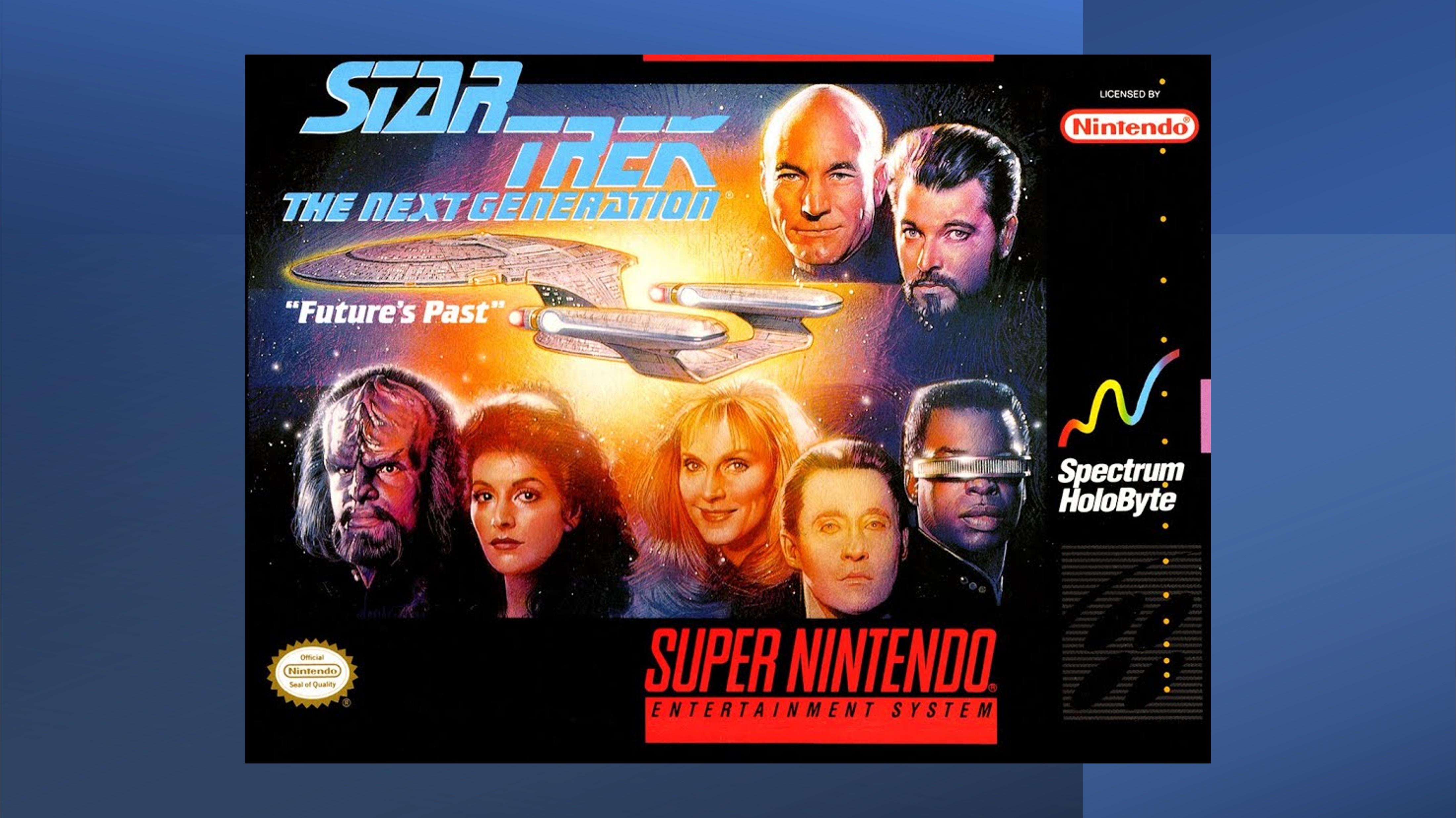
Drew Struzan touched upon Star Trek as well, and while his work there wasn’t as influential for me, one title stands out. In 1994, a Star Trek: The Next Generation video game was released for the Super Nintendo Entertainment System and the Sega Genesis. The former version was called Future’s Past and the latter was Echoes from the Past, but I only owned the Nintendo version. It showcased puzzle solving and strategy with the Romulans as the antagonists. The cover art for the Super Nintendo version showcased the Enterprise-D and the show’s core seven characters in Struzan’s elegant style. I invested a lot of hours in that game.
There are plenty of “honorable mentions” among the decades of Struzan’s work, including the Star Trek 25th anniversary prints, the TV Guide covers, and his work for the early Harry Potter film posters. There’s just so much he did to enhance and celebrate aspects of pop culture across the spectrum.
In the end, no matter what pieces we each admire, the pure and simple truth is that the landscape is richer for his talent and sadder for his passing. Drew Struzan was a master who touched the hearts of fans and franchises with his brilliant and fantastic work. I will forever be grateful for his talents and mark on our lives.

Culture on My Mind is inspired by the weekly Can’t Let It Go segment on the NPR Politics Podcast where each host brings one thing to the table that they just can’t stop thinking about.
For more creativity with a critical eye, visit Creative Criticality.
